

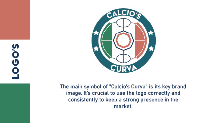


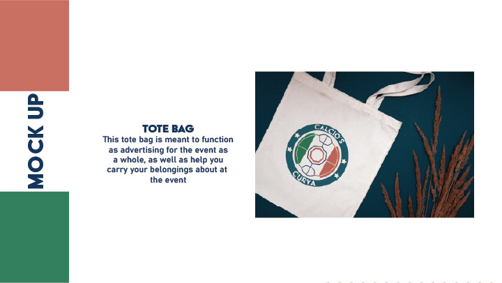
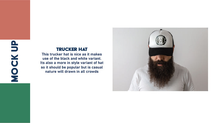


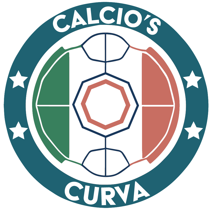


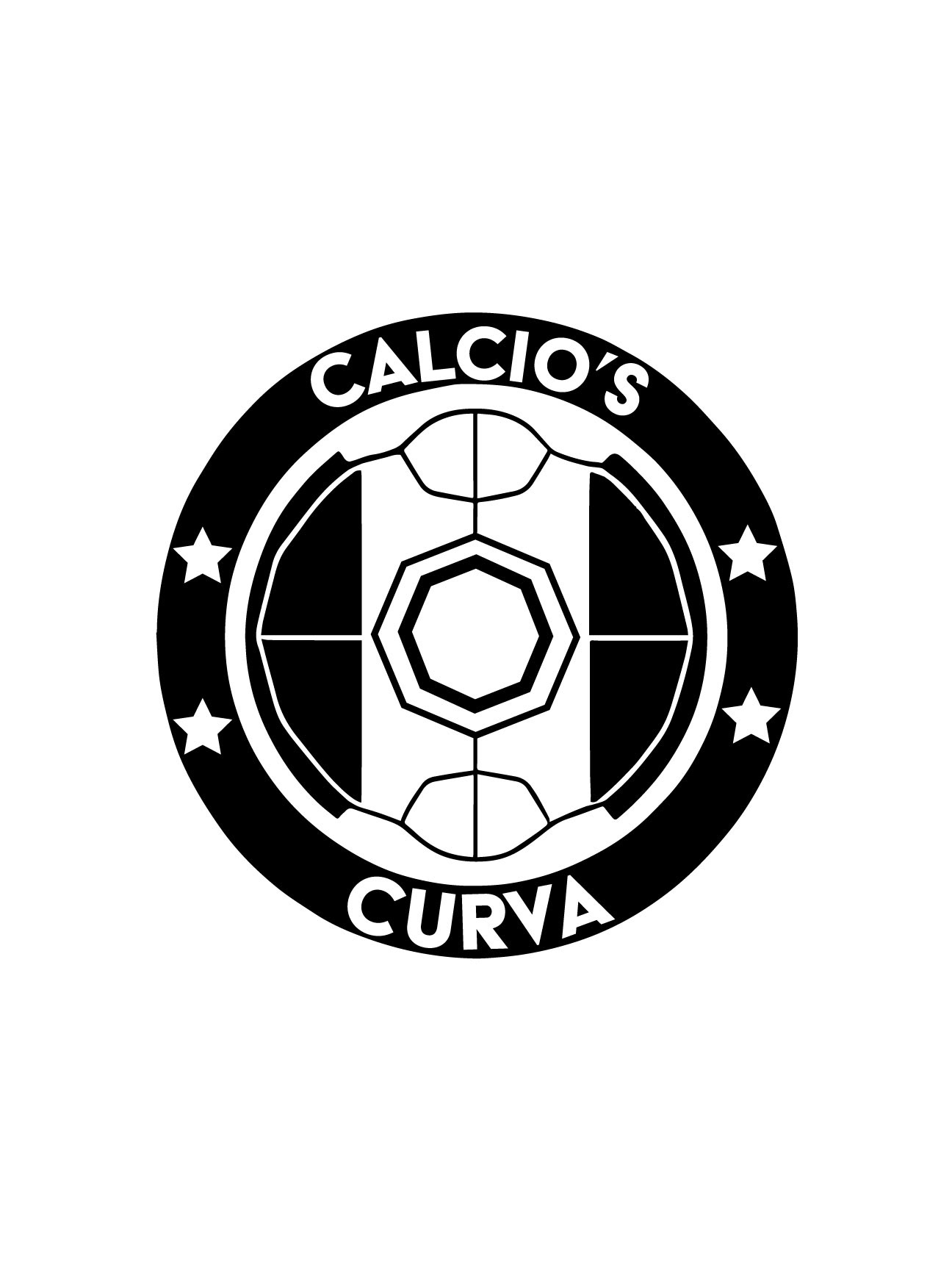
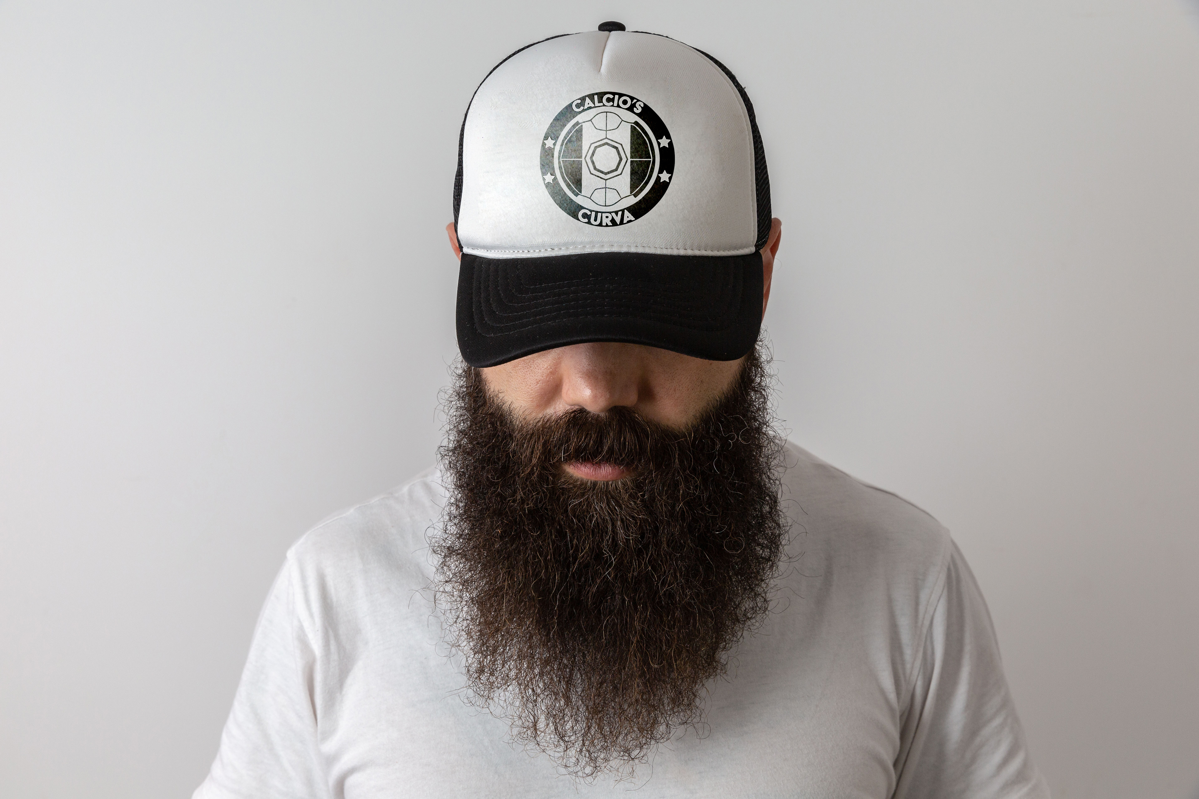
Calcio’s Curva — Italian-League Watch-Marathon Comprehensive Brand System & Collateral Suite | Self-Initiated Concept, 2025 Project Snapshot I built Calcio’s Curva as a proof-of-concept festival where U.S. fans binge an entire Serie A matchday together. The deliverable isn’t just a logo; it’s a turnkey identity toolkit that could drop straight into production—from pitch deck to merch table. Identity Core Element Rationale Image Highlights Crest-Style Logomark Mirrors Serie A club badges yet stays team-agnostic. Green ▸ white ▸ red pitch slices shout “Italy,” while a four-star ring nods to the Azzurri’s World Cup titles. Full-color & one-color variants, minimum-size grid, clear-space spec. Color Palette Blue Sapphire & Indigo add stadium-seating depth; Fuzzy Wuzzy rose keeps the tricolore fresh; Amazon green and white complete the flag. Slide 11—vertical swatches with Pantone call-outs. Typography Acier BAT (display) = bold curva banners; Bahnschrift (body) = crisp screen legibility. Slide 13—primary/secondary font lock-ups. Brand Voice Sliders Excited ▸ Calm, Casual ▸ Formal, Modern ▸ Traditional—to guide future copy & art decisions. Slide 16. Collateral Prototypes Merch Line-Up Canvas Tote — crest front-and-center for wearable OOH advertising. Trucker Hat — one-color badge; casual fit appeals across fan tribes. Coffee Cup — faux-leather texture + full-color sticker for early-kickoff caffeine. Direct-Mail Teaser Curved tricolore shapes wrap copy and fan photography; reverse side shouts “ARE YOU READY FOR THE FIGHT” in stacked Acier BAT. Brand Manual 24-page PDF covering logo usage, grid, color formulas, type hierarchy, and misuse examples—ready for hand-off to vendors. My Role Audience Discovery – Interviewed 15 U.S. soccer fans; distilled insights into passion, camaraderie, and playful rivalry. Concept Development – Sketched 40+ badge ideas, refined the final mark on a modular grid for scalability. Visual System Design – Defined palette, typography, and brand-voice axes; authored the complete style guide. Mock-Up Production – Rendered tote, hat, cup, and mailer in Photoshop/Dimension to demonstrate real-world flexibility. Presentation Build – Compiled a keynote deck: research → mood board → identity reveal → collateral showcase → rollout plan. Outcome The system proves I can take a festival from zero to launch-ready: research-backed strategy, cohesive identity, print-ready guidelines, and merch prototypes. It slots into my portfolio as a culture-rich case study that blends branding, environmental graphics, and fan-centric storytelling—all under one disciplined design language.