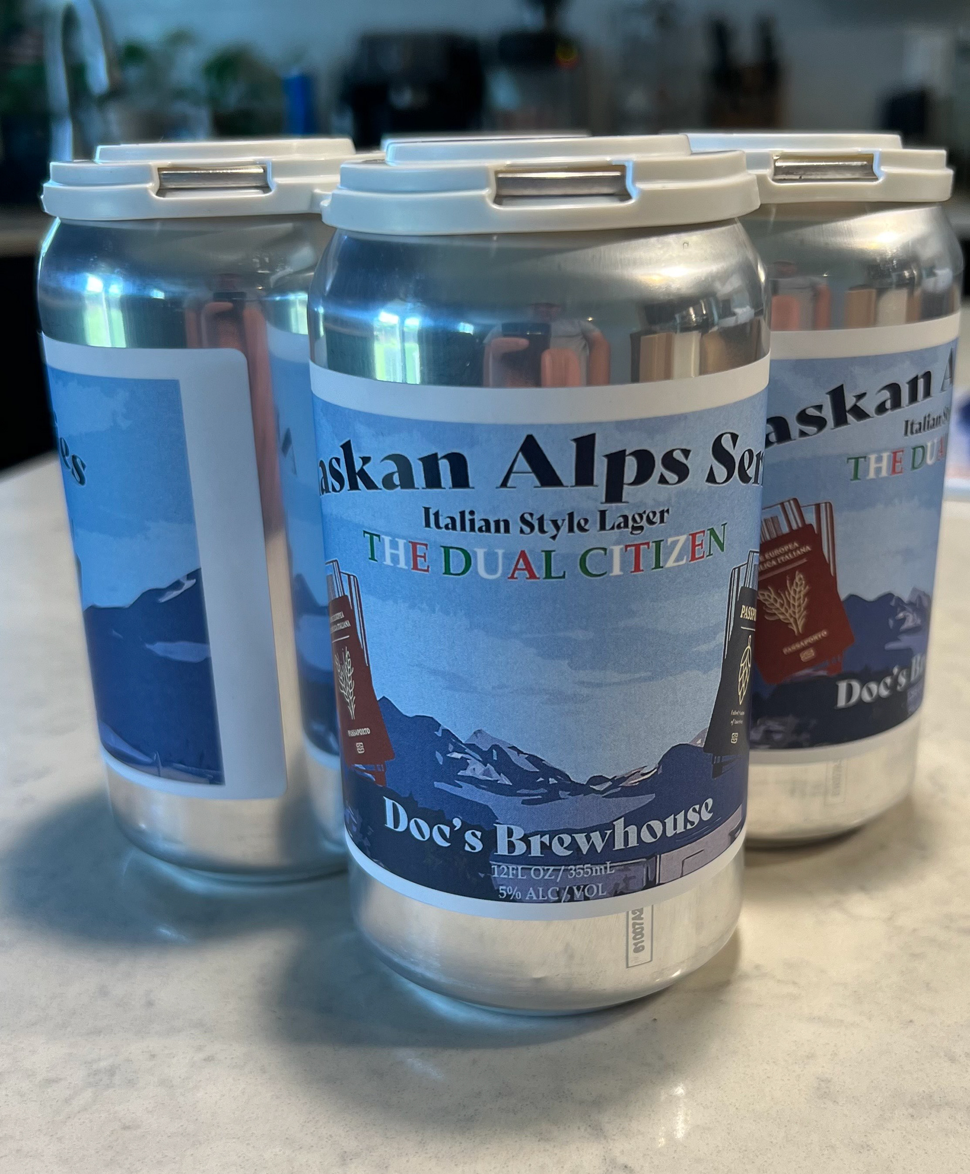
“The Dual Citizen” Beer Label Limited-Run Packaging | Solo Brewer Commission, 2025 Project Story A one-man brewery in Sitka asked for a label that married his Italian-American roots to the “Alaska Series” he releases in small batches. Working from the brewer’s phone shot of Baranof Island’s jagged skyline, I turned the mountain range into a layered vector illustration that spans the wrap-around. Center stage sit two passports—one Italian, one American—re-imagined with crossed wheat-and-hop crests in place of the usual globes, signaling the recipe’s cross-border DNA. Above the scene, the title The Dual Citizen alternates red ▸ white ▸ green, letting the Italian tricolore ripple across a glacier-blue Alaskan landscape. My Contribution Illustration & Iconography Redrew Baranof’s ridgeline, designed stylized passports, and created custom wheat-hop crests. Color & Typography Built a six-spot Pantone palette (tricolore reds/greens + glacier blues); alternated title lettering; paired a vintage Lombardic serif with a clean sans for compliance copy. Dieline & Compliance Adapted artwork to a 16-oz shrink-sleeve template, flowed UPC/ABV/Gov’t warning, and proofed at print scale for legibility. Pre-Press Coordination Delivered press-ready files, approved physical proofs, and fine-tuned spot densities to offset aluminum show-through. System Design Added a modular “Alaska Series” badge and batch-number lock-up so future releases can drop into the same framework without re-engineering. Result The finished label wrapped a limited run of cans, giving the brewer a cohesive visual identity for his Alaska Series and adding a narrative-driven packaging case study to my portfolio.